What you’ll learn
- Learn Installation of python and related libraries.
- Why Should you use Data Visualization in Analytics and Business Intelligence projects?
- Create beautiful visualizations with Seaborn
- Learn Data Visualization in Python
- Learn to use Seaborn for statistical plots
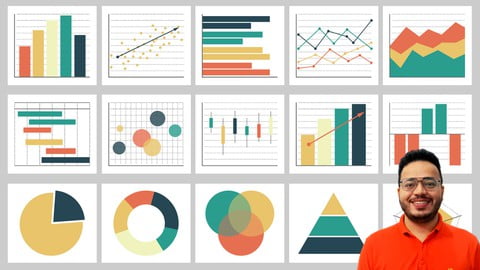
- Distribution Plot, Histograms, KDE Plots, Scatter Plot, Rug Plot, Joint Plot, Pair Plot, Bar Plot, Count Plot, Box Plot, Violin Plot, Strip Plot, Swarm Plot
- Heat Map, Pair Plot, Sub Plot.
How to Enroll Mastering Data Visualization with Python using Seaborn Lib. course?
How many members can access this course with a coupon?
Mastering Data Visualization with Python using Seaborn Lib. Course coupon is limited to the first 1,000 enrollments. Click 'Enroll Now' to secure your spot and dive into this course on Udemy before it reaches its enrollment limits!